A couple of months ago I wrote a thing about receipts and the utter pointlessness of P, T and M on that piece of paper. Admittedly, it’s not the most exciting piece of writing was it? On the other hand, it appears I’m not alone with this line of thinking. Jack Dorsey, you know one of the chaps that invented Twitter, apparently spoke at the US National Retail Federation’s annual Big Show conference (I suspect they are, close to what I thought was, a receipt industry) about this problem and ways the receipt can be better used as a communication tool to customers. If I was so inclined, I’d claim credit. You know, something along the line of how smart people follow my thinking. But, that’s pretty much a long-shot huh?
A little digging is a fascinating thing. It seems all sorts of pieces of paper could be improved with a small amount of design expertise. I was drawn to the idea of improving the receipt during an extended attempt to claim expenses for a recent trip. That trip included a train, a flight and several taxis. I know taxi paperwork is being improved: Uber and Kabbee do a great job of just emailing you the receipt after the journey – no more scribbled bits of paper that are incomplete. How many times have you had to add information to a taxi receipt yourself so that it was obvious what it journey it was for? They’re clear on where I have been and how much the journey cost. And email makes them easy to retrieve when it’s time to claim those expenses from the people that sent you there.
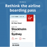
 As it turns out there are plenty of other people who think train tickets and plane boarding passes could also be improved. These are a bit more complex as, unlike many taxi receipts they have to be shown while the journey is in progress. To that end they contain lots of little nuggets that mean nothing to you and me but might be crucial to the ticket inspector or air stewardesses’ ability to quickly interpret the ticket. I like Neil Martin’s version of the British Rail ticket (others have had a good go too). But for some innovative thinking, take a look at Peter Smart’s version of the airline boarding pass. If you’ve ever had to look twice at your pass to see which terminal/gate you’re going from then this redesign couple be really helpful.
What I particularly like about both of the examples I’ve shown is the removal of industry speak. Those little airport codes, you know LTN to WAW, are really London Luton to Warsaw Chopin in real, human, understanding. Why not just say that? Unless the product is a business-to-business tool where the people using the system speak the language of the industry it’s never a good idea to confuse with codes and jargon; and even in industry-specific systems I’m not always convinced. In the airport the departure screens don’t show WAW so why should the ticket?
There will be those who think a digital ticket/boarding pass is the solution but that experience needs improving too. My British Airways mobile phone app once showed a partner airline’s flight number for the journey – so the on-board crew were very confused – and I’ve known people who have stood at the front for five minutes or more rebooting a crashed phone so they can show a ticket and take their seat. Paper may be around a while for those things.
Now I just need an original idea for something to redesign.
Further Reading: This post is a follow up to I Don’t Want A Useless Paper Receipt and is also the third in my BEWA posts. The first a rather random post, BEWA: Sound the alarm! All the letters have been taken. Last week’s post was Elsewhere: Writing the perfect RFP.
A couple of months ago I wrote a thing about the utter pointlessness of P, T and M on receipts. I expanded on that: http://t.co/sXKiUqXCyQ